top of page
Giuseppe Pizza - Concept Packaging Redesign
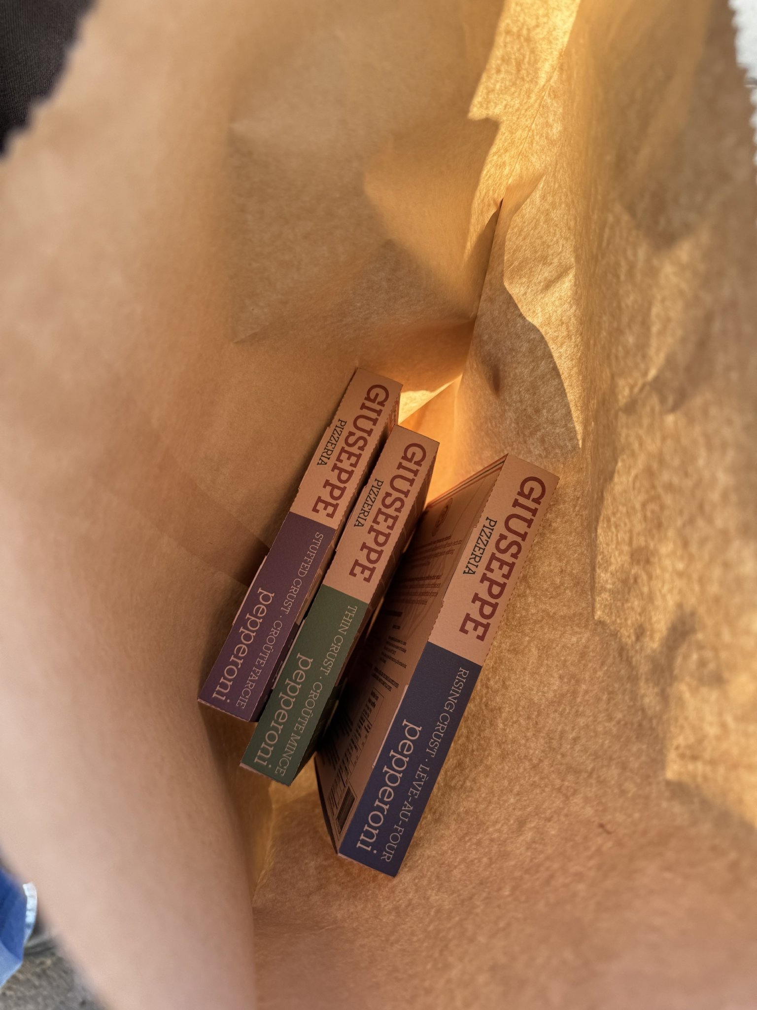
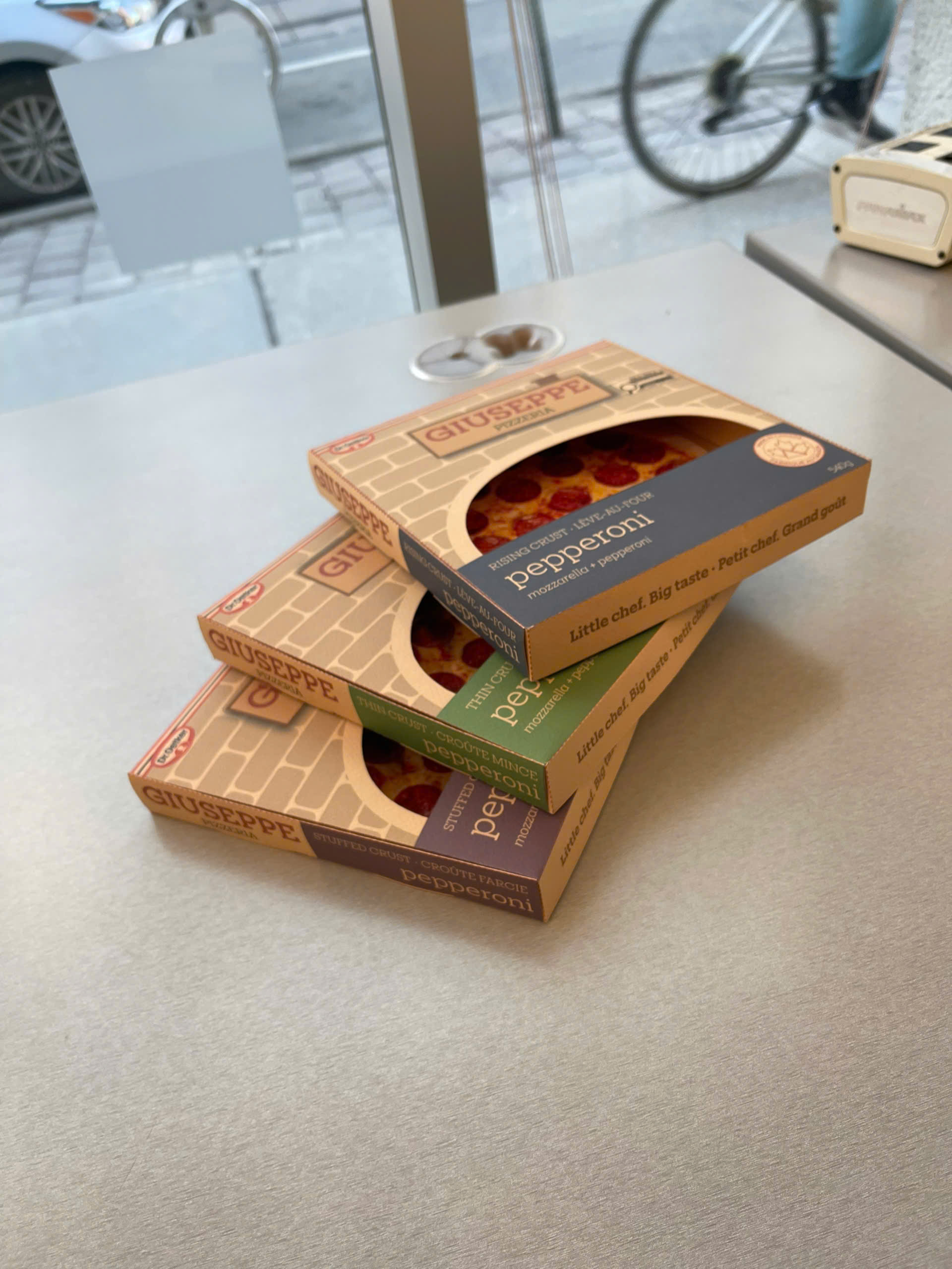
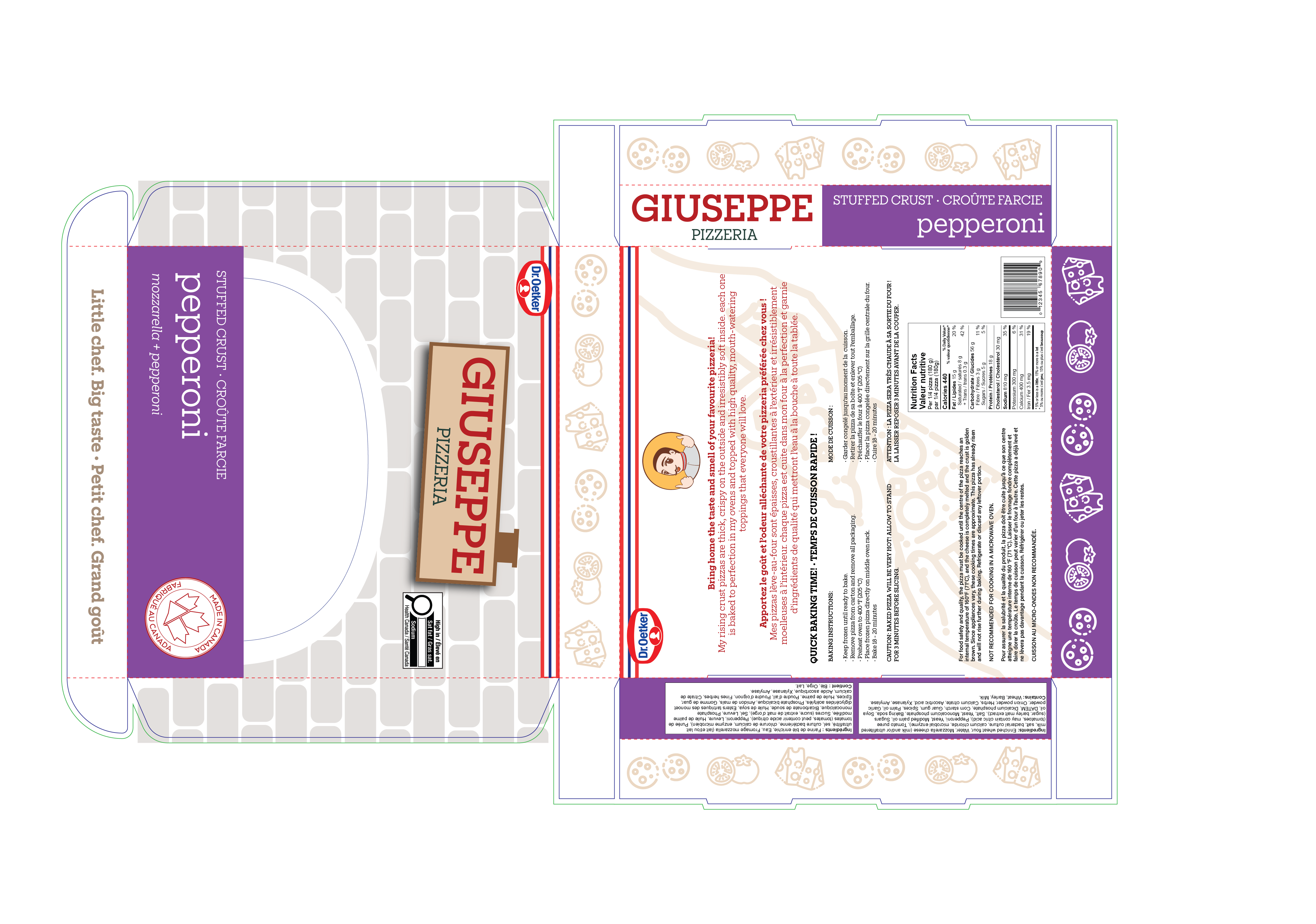
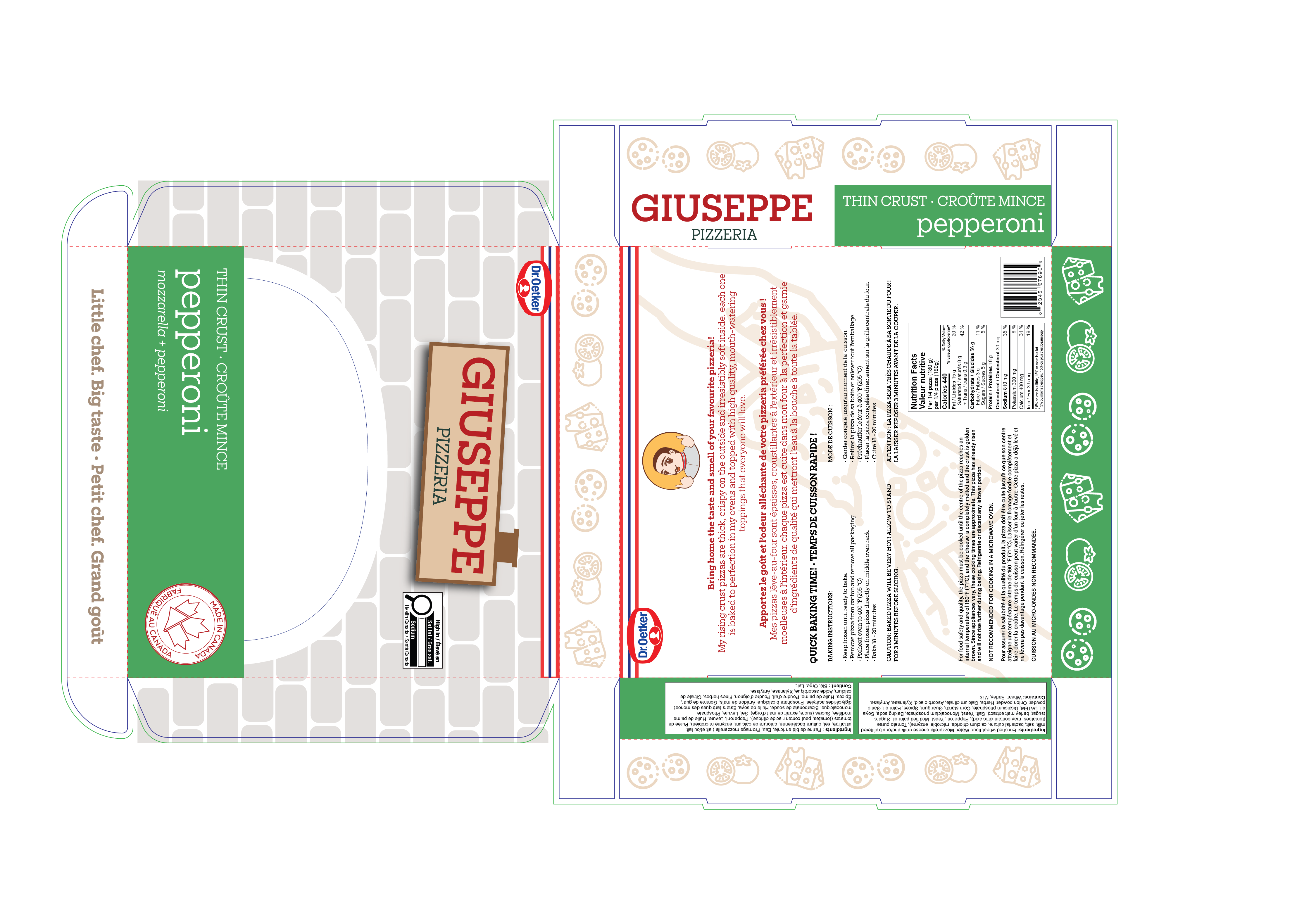
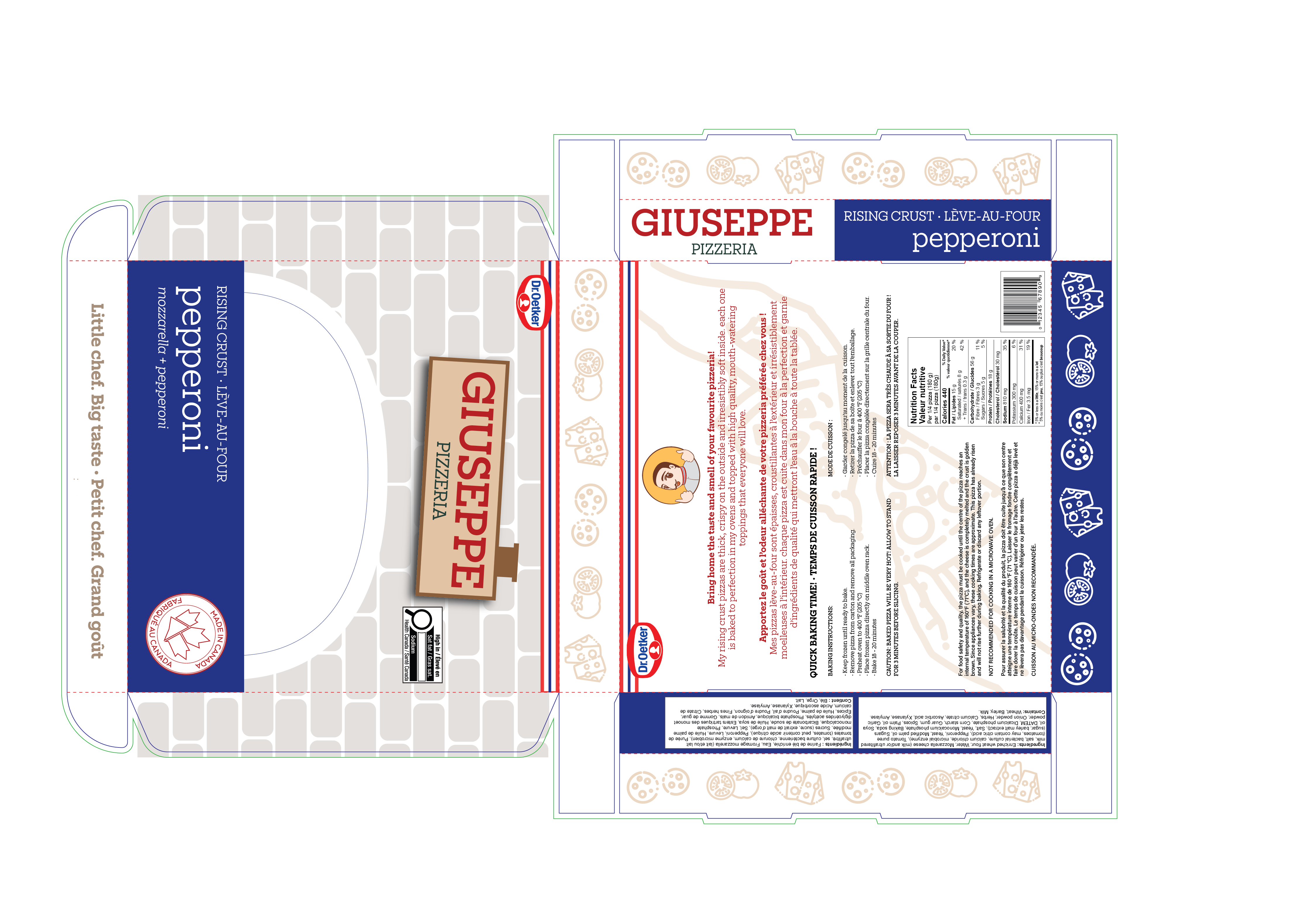
For this project, our team selected a single variety from Dr. Oetker’s Giuseppe Frozen Pizza line to conceptually redesign after evaluating packaged products on Ontario retail shelves. While the existing packaging successfully conveyed a charming, home-delivered pizzeria narrative, we identified opportunities to refine the visual hierarchy—particularly addressing the stylistic clash of the CGI mascot and the overcrowded information layout. Our redesign preserved the brand’s core pizzeria storytelling while introducing a cleaner, more cohesive aesthetic and clearer messaging structure that improves at-a-glance readability. We developed a consistent visual system across three SKUs—Rising Crust (Blue), Thin Crust (Green), and Stuffed Crust (Purple)—using the brand’s established color palette to maintain recognition while strengthening differentiation. The design meets regulatory requirements, including bilingual nutritional labeling and ingredient declarations, and was printed on kraft paper to support sustainability goals, resulting in a softer, more muted visual tone. My role included developing the refreshed brand identity, creating illustrations, designing within dieline specifications, and overseeing print production to ensure accuracy and quality.
Project type
Design
Date
March 2025

01
Giuseppe Pizza - Concept Packaging Redesign


bottom of page